Tailwind CSS
Frontend

Tailwind CSS

Tailwind CSS is a utility-first CSS framework that provides low-level utility classes for building custom designs directly in your markup.

Tailwind CSS is a utility-first CSS framework that provides a comprehensive set of low-level utility classes. Instead of pre-built components, Tailwind gives you building blocks like flex, pt-4, text-center, and rotate-90 to construct any design directly in your HTML. This approach enables rapid UI development with complete design freedom.

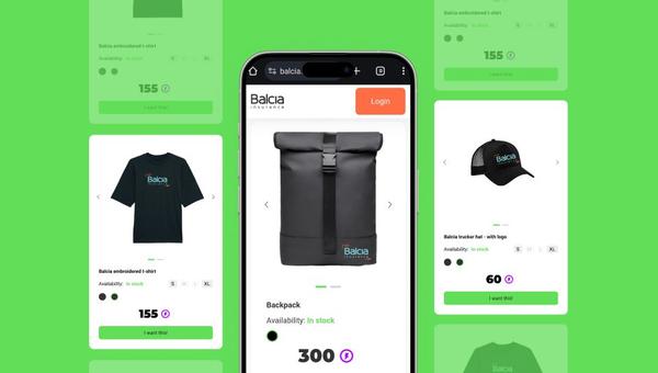
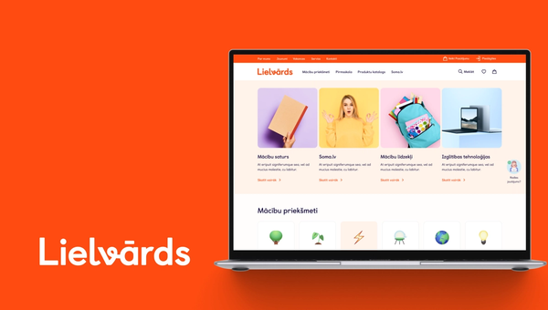
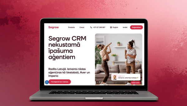
At iConcept, Tailwind CSS is our CSS framework of choice, used in 3 portfolio projects including our own website. We love its utility-first approach for building responsive, custom designs without writing custom CSS. Combined with Svelte components, Tailwind enables us to rapidly build beautiful, consistent interfaces.

FAQ

What is Tailwind CSS?

Tailwind CSS is a utility-first CSS framework that provides thousands of small, single-purpose CSS classes you combine to build any design. Instead of opinionated pre-built components, it gives you complete freedom to create unique designs while maintaining consistency through a design token system.

How to use Tailwind CSS?

Install Tailwind CSS via npm, configure it in your project's build tool, then apply utility classes directly in your HTML. For example, 'class="bg-blue-500 text-white p-4 rounded-lg"' creates a blue box with white text, padding, and rounded corners. The official documentation is an excellent reference.

How to install Tailwind CSS?

Install Tailwind CSS by running 'npm install tailwindcss @tailwindcss/vite' and adding the Vite plugin to your config. For other build tools, Tailwind provides specific installation guides. Then import Tailwind in your CSS with '@import "tailwindcss"' and start using utility classes in your templates.

Need help with Tailwind CSS?