Web Development Blog & Tech Articles

Top Software Development Estimation Methods You Need to Know
Discover essential software development estimation methods to improve project accuracy and efficiency. Learn how to choose the right approach today!
 Klāvs Andersons
Software Development Team Structure: Your Complete Guide
Master software development team structure with proven strategies from UK leaders. Discover frameworks that build high-performing teams and scale successfully.
Klāvs Andersons 
Ultimate Web Application Testing Checklist for Flawless Performance
Use this web application testing checklist to ensure quality, security, and performance. Perfect for a seamless user experience. Click to learn more!
 Inga Nipāne
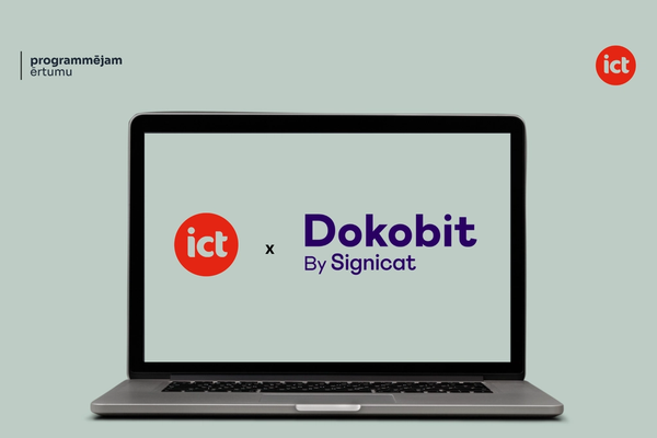
ICT becomes an official Dokobit partner for e-signature and identity integration
How clients benefit from this new partnership
 Ksenija Čerņavska •
How to Choose a Web Development Company in Latvia: Complete Guide
How to avoid empty promises and find the right partner.
 Gints Fricbergs •
Web Development Costs in Latvia 2026
What really shapes the price and where the budget goes.
Gints Fricbergs • 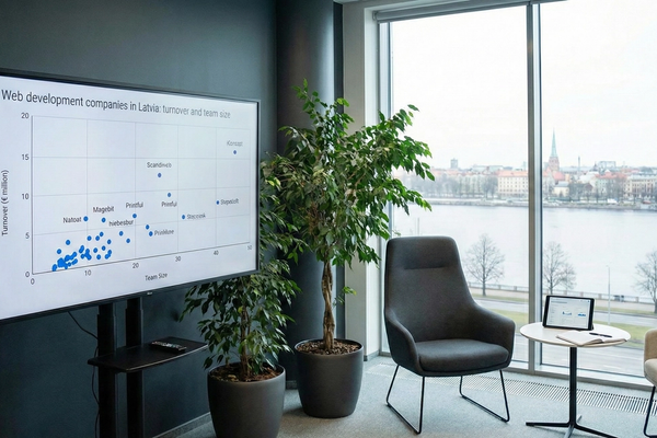
Web Development Companies in Latvia: Revenue and Team Size
Comparing 11 web development companies in Latvia.
Gints Fricbergs • Customer Onboarding Best Practices for Digital Products
Proven customer onboarding strategies that reduce churn and accelerate activation — covering progressive disclosure, personalisation, flow design, measurement metrics, and how custom software enables superior onboarding experiences.
Ksenija Čerņavska • E-Commerce Development Services: Building Online Stores That Convert
A practical guide to e-commerce development services — comparing Shopify, WooCommerce and custom builds, covering conversion features, integrations, timelines, costs, and how to choose the right development partner.
Inga Nipāne • Web Application Development Cost: Complete Pricing Breakdown
A transparent breakdown of web application development cost — covering complexity factors, team location, pricing models, hidden costs, and realistic budget ranges from MVP to enterprise-grade applications.
Gints Fricbergs • Digital Transformation Services: What to Expect and How to Choose
A practical guide to evaluating digital transformation services — what they include, how to measure ROI, common pitfalls, and how to choose the right technology partner for your business.
 Edgars Viļums •
 SEO Migration Services: Protecting Your Rankings During a Website Move
A technical guide to SEO migration — how to protect search rankings when replatforming, redesigning, or changing domains. Covers redirect mapping, URL audits, content preservation, and timeline expectations.
 Reinis Nartiss •
 Business Process Optimization: A Practical Guide for 2026
Learn how to identify inefficiencies, apply proven methodologies like Lean and BPM, and use custom software to streamline your business operations for measurable results.
Gints Fricbergs • Bespoke Software Development: When Off-the-Shelf Is Not Enough
An honest guide to bespoke software development — when custom is worth the investment, how the development process works, what it costs, and how to evaluate your options.
Edgars Viļums • Website Migration Services: A Complete Planning Guide
Everything you need to know about website migration services — types of migration, how to protect SEO rankings, redirect mapping, and what a professional migration plan looks like.
 Matīss Ruša •
 Website Maintenance Cost: What to Budget in 2026
A practical breakdown of website maintenance costs by site type, with honest guidance on what to budget for security, backups, performance monitoring, and ongoing support.
Klāvs Andersons • 
ERP System Development
When spreadsheets stop being enough for serious process control.
Ksenija Čerņavska • 
Digital Customer Experience: What It Is and How to Improve It
What makes customers stay instead of leaving in seconds.
Klāvs Andersons • 
Statamic development agency build smarter faster fully customized websites
Why some projects move faster and smarter with this platform.
Ksenija Čerņavska • 
What is System Integration?
How to make your tools finally work together.
Klāvs Andersons • 
Top Cloud Migration Best Practices for a Smooth Transition
Discover essential cloud migration best practices to optimize your move to the cloud. Follow these tips for efficiency, security, and success.
Edgars Viļums • 
The Ultimate Data Security Checklist for 2025: 7 Steps
Enhance your data protection strategy with this comprehensive data security checklist. Learn 7 key steps to safeguard sensitive information in 2025 and beyond.
Reinis Nartiss • 
Database Design Fundamentals: Your Complete Guide to Success
Master database design fundamentals with proven strategies that work. Learn from industry experts who've built robust systems and discover practical approaches.
Gints Fricbergs • 
Top Database Optimization Techniques for Faster Performance
Discover essential database optimization techniques to boost performance, improve queries, and streamline data management effectively.
Gints Fricbergs • 
DevOps Adoption Roadmap: Transform Your Business Success
Master your DevOps adoption roadmap with proven strategies from industry experts. Practical insights for business transformation that delivers results.
Ksenija Čerņavska • 
Top Microservice Example Architectures for Modern Applications
Discover real-world microservice example architectures that boost scalability, resilience, and agility across various industries. Learn more now!
Matīss Ruša • 
Top Web App Examples: Discover Innovative Apps Today
Explore 10 web app examples showcasing innovative features and design. Discover how these web apps can inspire your next project!
Matīss Ruša • Top Website Performance Indicators to Boost Your Site in 2025
Learn the key website performance indicators to optimize user experience and improve rankings. Discover how to boost your site's success today!
Matīss Ruša • 
Protect Your Business with a Website Security Audit
Discover how a website security audit can safeguard your business. Learn about key security checks and get expert tips today!
Ksenija Čerņavska • 
8 Key Software Quality Metrics for Top-Notch Code in 2025
Improve your software quality with these 8 key software quality metrics. Learn how to measure and improve code coverage, defect density, and more in 2025.
Gints Fricbergs • 
Top 10 Popular Web Frameworks in 2025 for Your Projects
Discover the best popular web frameworks in 2025. Find the perfect choice for your web development needs with expert insights and trends.
Inga Nipāne • 
Top Software Development Methodologies for 2025
Discover the best software development methodologies in 2025 to optimize your projects and stay competitive. Learn which approach suits your team today!
Reinis Nartiss • 
Top Laravel Web Development Services in 2025
Discover the best Laravel web development services in 2025. Find expert providers for custom solutions, e-commerce, and more. Get your perfect partner today!
Reinis Nartiss • 
Managing Web Development Projects: Expert Strategies for Success
Learn effective managing web development projects techniques. Discover tools and tips to ensure project success and deliver results.
Klāvs Andersons • 
Top Web Application Security Best Practices for Protection
Discover essential web application security best practices to safeguard your site from threats. Learn key tips to enhance security today!
Inga Nipāne • 
What is Single Sign-On (SSO)?
Fewer passwords, less chaos, and easier access to everything.
Klāvs Andersons • How Do You Set Up an Online Store?
What your store needs to do more than just look good.
Klāvs Andersons • 
From Web Development Services to Product Building: Why We Burned €200,000 on Tipcall (And Still Think It Was Worth It)
A few years ago, I came across a quote that really stuck with me: “Web development outsourcing companies don’t create real added value — they only create added value for others.” At the time, I co-founded iConcept, a software agency providing web development services. We were growing steadily. But that quote triggered something deeper — a question: What if we could create value for ourselves too?
Klāvs Andersons • 
Website Development: A Complete Guide
What to think through early to avoid costly mistakes later.
Klāvs Andersons • 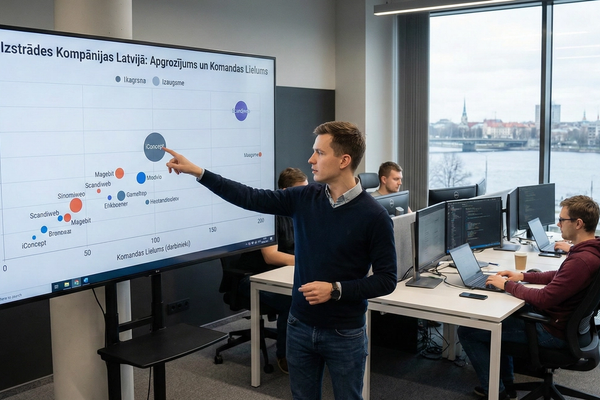
Competitive Analysis Framework for Software Companies
How to analyze the market in a way that leads somewhere useful.
Klāvs Andersons • 
How to Improve Customer Service with Custom Software
Where service time gets lost and how software helps win it back.
Klāvs Andersons • 
Web-Based Application Examples: Types, Use Cases, and When to Build Custom
Real examples of apps that save time and reduce daily friction.
Klāvs Andersons • 
REST vs SOAP: Choosing the Right Web Service for Your Project
A simple comparison to make the choice less painful.
Klāvs Andersons • 
How to Measure Customer Satisfaction: NPS, CSAT, and CES Explained
Not just gut feeling - metrics that reveal what customers think.
Klāvs Andersons • 
What Is Apache Web Server and How Does It Work?
What happens behind the scenes to keep your website available.
Klāvs Andersons • 
What Is Backend Development? Server-Side Basics Explained
The invisible side that keeps everything running.
Klāvs Andersons • 
How to Create a Marketplace Website: Features, Payments, and Build vs Buy
What separates a real platform from just a nice idea.
Klāvs Andersons • 
What Is a Progressive Web App? A Practical Guide for Businesses
When you do not need a separate app to deliver a great experience.
Klāvs Andersons • 
What Is User-Centered Design? Principles That Actually Drive Results
How to create products people understand without explanations.
Klāvs Andersons • 
Document Management Best Practices for Growing Organizations
Less document chaos, more order and control in daily work.
Klāvs Andersons • 
IT Systems Integration: Connecting Your Business Tools the Right Way
How to avoid duplicate data and manual work across systems.
Klāvs Andersons • IT companies in Latvia why businesses trust baltic software development in 2025
Latvia has emerged as a premier destination for software development, combining highly skilled tech talent with competitive costs and rigorous European quality standards. Businesses worldwide are discovering why Baltic IT companies deliver exceptional value without compromising on innovation or reliability. Explore what makes Latvia's tech ecosystem stand out in 2025.
Gints Fricbergs • 
Top Business Process Automation Examples
Where automation brings the fastest payoff and less routine work.
Gints Fricbergs • 
Project Management for Web Development That Actually Works
Master project management for web development with proven strategies from successful agencies. Turn chaotic builds into smooth deliveries.
Gints Fricbergs • 
Laravel Development Services: Choosing the Right Partner for Scalable Growth
If you have existing Laravel system or you are evaluating tech stack read this.
Klāvs Andersons • 
App Development
What makes an app intuitive, appealing, and easy to use.
Klāvs Andersons • CRM system development
Signs your business has outgrown spreadsheets.
Klāvs Andersons • 
Drupal website development
When you need more flexibility than a simple content site.
Klāvs Andersons • 
HTML/CSS programming service
The basics behind a fast, clean, and reliable website.
Ksenija Čerņavska • 
Creating a concept for a sustainable website
How to plan for long-term growth, not just launch day.
Matīss Ruša • 
Landing page development
How one page can bring more leads than your whole website.
Edgars Viļums • Website Development in 2026: Costs, Process, Technologies and Common Mistakes
What separates a thoughtful solution from a quickly built site.
Reinis Nartiss • 
Website audit
How to spot what is hurting results before spending more.
Edgars Viļums • 
SEO Guide - 6 Important Points
Essentials you need for steady organic traffic.
Inga Nipāne • 
System Development
When off-the-shelf software stops being enough.
Inga Nipāne • 
Website development using a custom content management system (CMS)
When a standard CMS starts holding your team back.
Matīss Ruša • 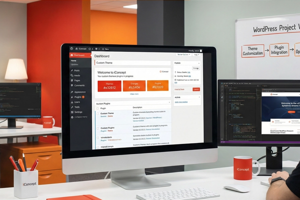
WordPress website development in 2026: advantages, cost, and when to choose it
When WordPress is a smart choice - and when it is not.
Klāvs Andersons • 
Do you know what the logos of BMW, AMAZON, LG and other popular brands actually symbolize?
What famous logos communicate before you even read the name.
Matīss Ruša • 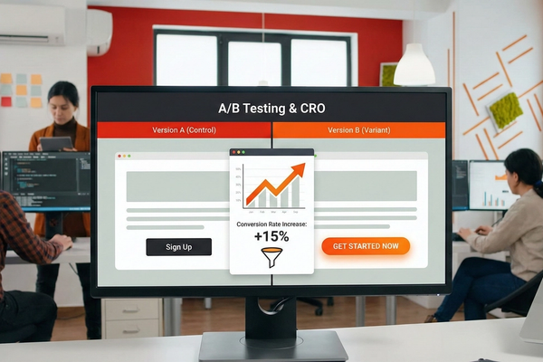
AB testing and conversion rate optimization
How small tests can lead to bigger conversion gains.
Matīss Ruša • 
What is the difference between a CRM system and an ERP system?
Two systems people mix up all the time - for good reason.
Inga Nipāne • 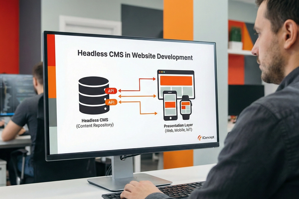
Using Headless CMS to develop a website
When this approach gives you more freedom, speed, and flexibility.
Inga Nipāne • 
Legal risks for website owners
Mistakes that can cost website owners more than expected.
Ksenija Čerņavska • 
Clean R's New Client Portal Developed in Just 3 Months Case Study
How to launch a large portal fast and without unnecessary chaos.
Gints Fricbergs • 
What is User Experience?
Why a smooth user experience is never just an accident.
Edgars Viļums • 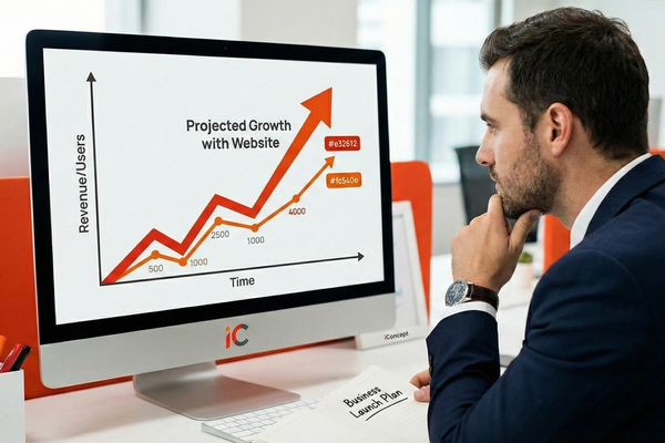
I'm planning to start a business. Do I need a website?
When you can still manage without a website - and when it hurts.
Inga Nipāne • 
Predictions for the Future of E-Commerce: What's in Store in the Coming Years?
What will change the way people shop online in the coming years.
Matīss Ruša • 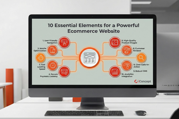
10 Essential Elements for Building a Powerful Ecommerce Website
What helps turn visitors into buyers instead of lost clicks.
Ksenija Čerņavska • 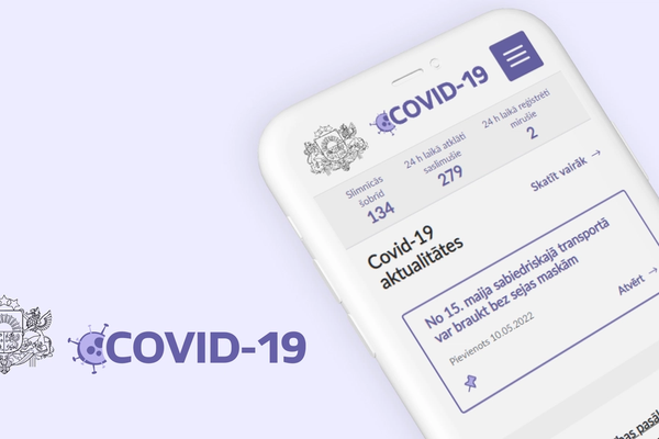
How to accomplish a year's work in two weeks? A Covid19 case study.gov.lv
How to build fast when there is no room for mistakes.
Inga Nipāne • 
Responsive website design
Why mobile experience is no longer optional - it is expected.
Edgars Viļums • 
What's New in Website Design and Development? 2020-2021 Trends
Trends that changed what users expect from the web.
Edgars Viļums • 
Website development and its main stages
A clear path from idea to launch without unnecessary chaos.
Matīss Ruša • Cost of website development
Why one website costs hundreds and another costs thousands.
Klāvs Andersons • 
How much does it cost to develop a website?
What affects the final price beyond design or page count.
Matīss Ruša • 
Social Media Business: An iConcept Guide
How to tell which channels are actually worth your time.
Matīss Ruša • 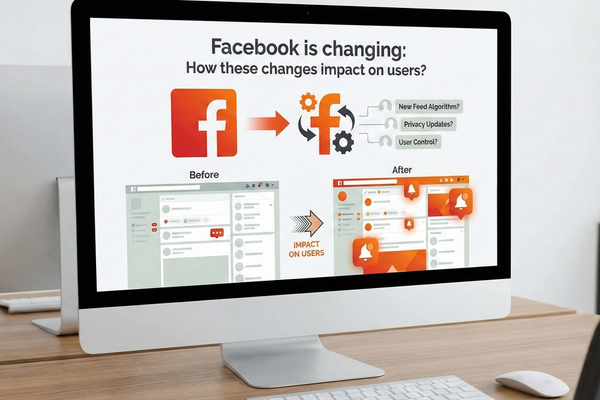
Facebook is changing: how will the changes affect users?
Changes that affect both users and business visibility.
Klāvs Andersons • 
Things that characterize bad websites.
Signs users notice before leaving your site in seconds.
Ksenija Čerņavska • 
Responsive Website Design – Necessity or Waste?
Is it really a must-have, or can you still go without it.
Gints Fricbergs •