How long does web design take, and what are the costs?
Project timelines and costs vary based on complexity, requirements, and other factors. Specific estimates depend on the project scope.
Service
In a crowded digital market, consumers seek efficiency and simplicity. They seek a fast, direct path to their goal, free of delays or distractions. A smooth, user-focused web design is crucial, making professional UX/UI design key for business conversion.
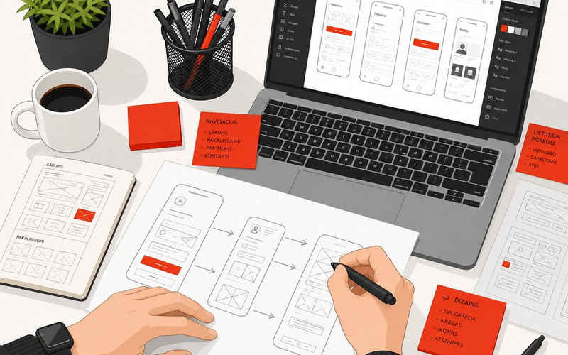
UI and UX design focus on creating a seamless user experience and a visually appealing user interface. This process goes beyond aesthetics; it emphasizes ease of use, efficiency, and intuitive design. This involves everything from the initial concept to testing and customization.
UI design shapes the visual elements of a website or app. Buttons, text, images, colors, and animations—all these small yet crucial details contribute to the overall experience. It’s the space where visual appeal meets practical functionality.
UX design ensures that every element on a page or app functions smoothly and quickly. It considers user interactions across different devices, aiming for a consistent, pleasant experience. A positive user experience translates into higher engagement, more clicks, and repeated visits.
ICT is the partner for:
Different projects require unique approaches. Some call for subtle aesthetics that create a comfortable environment, while others need to make a bold visual statement. Effective design is more than style—it’s about functionality, clarity, and ease of use.
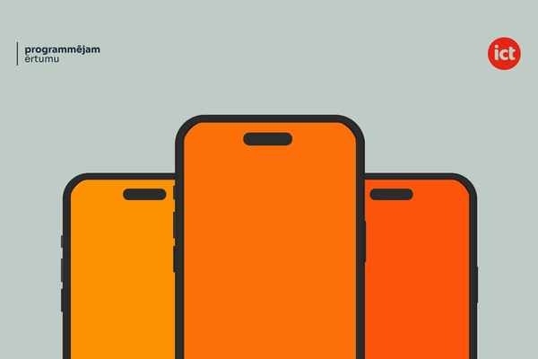
Consistency across devices is critical for a seamless user experience. Responsive website design ensures a site or app looks and functions well on all screen sizes. Whether improving an existing solution or building from scratch, responsiveness is a key focus.
Given the competitive nature of the space, app design places a greater emphasis on functionality. The goal is to capture and maintain attention quickly, using visual cues and intuitive design to communicate efficiently.
Systems design covers everything from definition and creation to testing and implementation. It involves adapting existing systems or building new ones, including management tools, internal systems, web programs, and databases. From idea to execution, ICT brings clarity and structure to complex needs.
Design: building and refining digital systems, focusing on user interfaces and experience for full functionality.
Usability: a UX/UI audit provides a detailed analysis of a digital product from the user's perspective, identifying areas for enhancement and ensuring an optimal user journey.
UX Research: Information Architecture creates a clear digital strategy, organizing and structuring content for websites and apps.
Accessibility and Usability: testing ensure that digital products work well for users of all abilities and needs.
Design Prototyping: offers a visual preview, showing how the concept will look as a complete product.
Responsive Design: adapts websites seamlessly to different devices, including desktops, tablets, and smartphones.
Website Design: aligns a website’s appearance with brand standards and key functionalities, creating an engaging and user-friendly digital space.
Wireframe Sketch: outlines the initial structure of an interface, mapping out core elements and user pathways.
Web design is a core competency, with ICT specialists excelling in delivering exceptional results. For high-quality web design services, contact us via email at info@iconcept.lv or call +371 67 288 887 to explore tailored solutions.
Project timelines and costs vary based on complexity, requirements, and other factors. Specific estimates depend on the project scope.
Strong web design can improve SEO performance. Search engines favor sites with fast load speeds, intuitive navigation, and mobile-friendliness, while quality content enhances ranking potential.
Successful web design prioritizes simplicity, consistency in design elements, user-friendly navigation, quick load times, and compatibility across different devices.
Effective UX/UI design ensures a positive user experience, helping users quickly find information. It boosts user retention, enhances sales potential, and strengthens brand perception.
Why a smooth user experience is never just an accident.
 Edgars Viļums ·
What makes an app intuitive, appealing, and easy to use.
 Klāvs Andersons ·
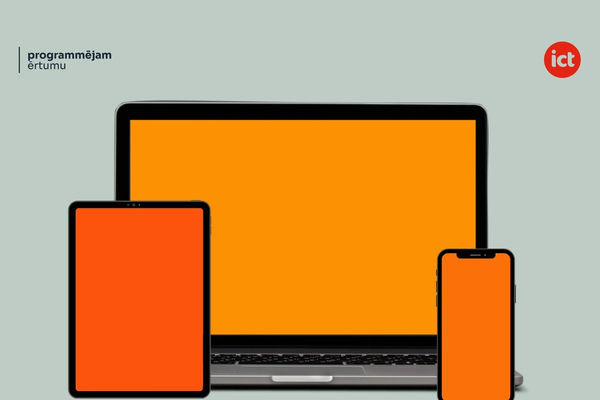
Is it really a must-have, or can you still go without it.
 Gints Fricbergs ·


